LO1 know how exiting advertising campaigns embed advertisements across a range of media products
P1: Describe an existing media advertising campaign
Aims and Objectives
One of the campaign's objectives was to target all Americans—regardless of age, gender or physical fitness level—and Nike's fundamental objective was to represent sneakers as a fashion statement to consumers, which led to Nike apparel becoming worn as more than just fitness gear.
Target Audience
Nike ‘just do it’ target market is largely consumers ages 15-45, all genders. Nike has focused its marketing efforts on the digital space in recent years, prior to this they advertised primarily on print.Key Messages
The campaign embodied Nike's image as an innovative American icon associated with success through the combination of professional athletes and motivational slogans emphasizing sportsmanship and health. This led to customers associating their purchases with the prospect of achieving greatness.Approach
The approach that Nike has to the viewers and wanted to covey a simple black and white logo that is eye catching to the target audience.Representation
Nike wanted to make this logo friendly and gender neutral, as black and white could be classed as user friendly and appealing for all because most people like simple but effective logos.Campaign
The slogan was coined in 1987 at an advertising agency meeting. The founder of the Wieden+Kennedy agency, Dan Wieden, credits the inspiration for his "Just Do It" Nike slogan to Gary Gilmore's last word: "Let's Do It".Logistics
Nike as a company had to do a lot of planning to get it where it is now for example, billboards, posters and many more other resources. Due to the development of technology they did not have to worry about advertisements on social media as technology was not as advanced in 1987.
Choice of Media
Nike uses multiple social media platforms to create a lifestyle and a community among customers. Its tweets are short, punchy, compelling, and nearly always include the hashtag #justdoit or other society supporting hashtags like #nikewomen. Nike has social media profiles on all major platforms such as Facebook, Twitter, YouTube, Pinterest, and LinkedIn. The brand diversified their online presence by creating separate pages for its products catering to different target audiences.
Call to Action
Nike try to build and have a great relationship with there customers, by creating a two way conversation with customers. Nike constantly evaluates and gains feedback from customers through a variety of polls on social media, as well as measuring common purchases and favorites in their Nike accounts. Nikes slogan of 'Just Do It' is catchy and encourages interaction with customers as well as being a positive phrase that gets adapted for all aspects of peoples life's.Relevant Legal and Ethical issues
When Nike put together a new product, advertisement or campaign they are met with a number of potential ethical and legal issues. Some of the ethical issues that Nike are met with including human, worker and animal rights. As well as these we have to ensure they are following the guidelines for pollution, environmental and political activities.Other legal aspects which need to be considered are the equality laws, of gender, wage and working hours.
Regulatory Bodies
LO1 know how exiting advertising campaigns embed advertisements across a range of media products
M1: Evaluate different cross media advertising campaigns for consistency of message
LO2 Be able to plan a cross media advertising campaign to a client brief
P2: Create a plan for a cross media advertising campaign in response to a client brief
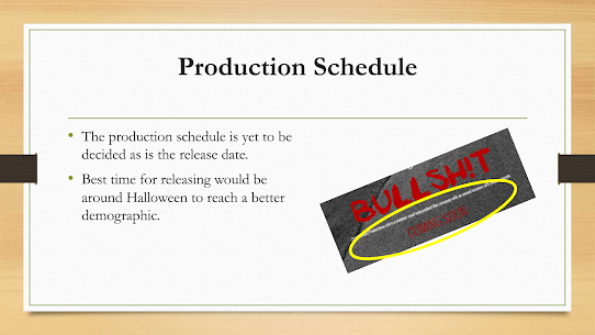
Working Title: BULLSH!T
Product: I aim to produce promotional material for a Horror /Thriller short film based in a well know local area in Liverpool.
Specifications: The types of promotional materials I will be developing are billboards, digital marketing, poster/print, bus wrap and other digital screening content.
Purpose: The purpose of my promotional resources is to promote a local film in a well-known local area. It has a purpose of entertaining the audience while at the same time adding an element of surprise and thrill to the screening.
Inspiration: The inspiration I have considered when designing this promotional campaign, I have looked at IT (2017) and Wrong Turn (2021). Both film advertisements have gotten similar colour schemes with dark and dull contrasts. The Font is also very gothic which is like that of the style I will be using for my advertising logo. The colour of the font on IT is the same reddish colour I will be using on BULLSH!T as it symbolises blood, fear, and death.
Advert Content: The advert will contain basic black and white photography of the location where the film is set. In this case it is Croxteth Park. There will be very text included to eliminate the chance of ruining the story line. The title will be written in gothic red horizontal across the bottom of the image. The slogan will appear across the top of the advert in white basic text “Please Believe” to keep the viewers on edge and give them the excitement and query that it could be true horror.
Target Audience: Like most horror/thriller films the target audience will be 17–25 year-olds, with a demographic of 70% male to 30% female. However, those people who are familiar with the area where the film is set will be attracted to the film as they will be encouraged to watch it as they can connect further with the location.
Resources and Personnel: In the designing process of the advertisement, I have used numerous software and design materials. For the image I used a primary resource from photographing the scene in person. Following on, amendments had to be made to the image using Adobe Photoshop to edit the photo contrast and insert all the texts.
Distribution and Marketing Methods: I plan on several print adverts which will be pasted around bus/train stations and stops, newspapers, billboards as well as bus wraps. In addition to this I will ensure I use digital screens around the city centre for a wider audience. Social Media marketing will be a major method that will be used with the opportunity to do targeted promotion to appear on the demographics social media feed also allowing them to self-share the advert which can hit a wider audience.
P3: Create a pre- production plan for the media components in the planned advertising campaign
Assessment Criteria for P3:
YOU are required to produce pre-production materials for their planned media components.
These may include: pitch documentation; research into genre and conventions; images and mood boards; production schedule with proposed launch dates; any other relevant material (i.e. sample footage and sounds).
Evidence could be produced in the form of a formal word-processed document, presentation or hand drafted documentation with supporting notes and digital files.
M2: Justify the choice of planning components by targeted media sector
You must justify your choice of components (elements which make up a Horror/Thriller genre poster) and the reasons why they have been incorporated within the advertising campaign.
While planning each component and elements of my posters I have had to take into consideration several factors to ensure maximum response for my advertising campaign.
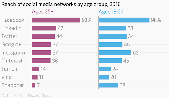
I will ensure that the target media sector is a focus in terms of what will be the best social channels for my target audience of 17 - 25 years old's. As previously stated, this will be aimed towards 70% male demographic to 30% female, however, within the local area the citizens within the county of Merseyside. I feel that twitter, Instagram, Facebook and Linked in are the best social platforms to be used for this group and short clips for Tik Tok.
The products I will be creating and producing for promotional purposes are of a wide variety. From posters to be displayed around in physical locations, billboards and digital advertisements on social media, and digital screenings in pop up areas. To Bus wraps for multiple routes to the bus and train stations.
Title: BULLSH!T
Slogan: Please Believe
Information: The film will be set in a local park which is well thought of and known in the surrounding area. However, there have been certain rumours which suggest that the Bulls which live on the grounds of the country park have turned evil. But due to the safe environment of the park’s safe reputation, people in the community refuse to believe the rumours which link to the slogan of the film ‘Please Believe.’ This is short and catchy to stand out with the audience and it fits in with the theme of thriller as it is exciting and adds an element of nerves if it is true.
Celebrities: Some of the local celebrities from Liverpool will be starring in the film. This is to inspire young performing arts people so that it is possible for big actors to perform in their own city. There will also be an opportunity for the local youth performing arts students to apply for extra roles.
Imagery: I have used an image of Croxteth park as it is the main set scene for the film. This could increase the number of viewers of the film because it will make people want to watch a film being set in their area. Black and white images to set the scene and provide an unnerving approach.
Fonts, Font size, font colours: I have chosen a gothic red font to emphasis the genre of the film as the red has a symbol of blood and danger, also red is a colour considered truly relevant to the use of Bulls in the film. The slogan however is simplistic and plain stating ‘Pease Believe’ to catch the audience's attention with the hope for them to find the truth in the production.
General colours to be used, layout, positioning of elements: I have used the Black and white imagery which is familiar theme within horror/thriller advertisement productions. The image is of a long path within the main setting providing an open fear. You cannot see the end of this could signify that this situation that is going on could be endless.
D1: Discuss the legal and ethical constraints within the planning campaign.
Legal and Ethical issues are about ensuring that a product being created does not cause any offence by containing harmful messages implicit or explicit towards a certain group of people, representing them with respect, dignity and sensitivity. This could possibly be suggested from my Horror film promotional material as the imagery being used in a religious setting with churches and crosses featuring in my posters.
I must also ensure that the materials and typography I am using is not being represented in a manner similar to a previously developed advertisement under copyright laws. If these regulations are broken then it could be dealt with by Trading Standards Office, which may result in being fined, prosecuted or even imprisoned.
In resolving this issue, my promotional poster includes an explicit word ‘BULLSH!T’ this could offend a younger audience, this could have a negative impact on my viewers, so to prevent this from happening I will change the ‘I’ in the title to an explanation mark.
We must ensure that know concerned viewers consider the content or language is an act of Slander, as the promotional products and film itself make no false accusations or implications of any kind, keeping in mind when creating the product that anyone who could potentially feel this way doesn't because of the handling of the representation.
The films plot and editing will be created with this idea in mind as to avoid anything that could be claimed as legal slander. Another possible cause for issues would be the use of blood in the posters and billboards.
When developing the advertisements, I must unsure I am following the Data Protection Act when collecting personal information of any cast or crew member ensuring the data is safe and secure.
Ethical information can only be given if the subject allows and should not be forced in lines with the equality act, however, if this is provided we must ensure this sensitive information is safeguarded strongly.
Finally, I must ensure that I am abiding by The Copyright Designs and Patents Act (1988), this act gives creators of digital media the rights to control how their work is used and distributed. Any sound, imagery or videos created by someone else can not be used under the copyright law.
LO3 Be able to produce the planned media components
P4: Create the media components to be used in the planned campaign
M3: Explain how to create media components comply with the codes and conventions of the media sector.
Technical, textual, and symbolic methods used to generate or indicate meaning in media forms and products are referred to as media codes. Camera, acting, setting, mise en scene, editing, lighting, sound, special effects, typography, colour, visual composition, text, and graphics are all examples of media codes
codes and conventions or billboards / social media and Horror/Thriller genre posters
D2:
Demonstrate how the technical and aesthetic properties of the media components
meet the client brief
Learners are required to demonstrate
how the advertisements technical and aesthetic properties meet the requirements
of the clients brief and their preproduction plan.
Learners should evaluate their final
components against their client brief and demonstrate how the components
support the advertisement campaign.
THE
CLIENT: 21st Century Productions Ltd.
ABOUT THE CLIENT: 21st Century Productions Ltd is a medium sized independent film company with an annual turnover of 15 million pounds.
They specialise in producing high quality short film productions aimed
predominantly at an audience aged between 17-25 years.
The
audience/customer is approximately 70% male and 30% female.
They
have achieved a reputation in particular for producing films of the Horror/Thriller
genre. It is this specialism that they wish to develop and promote.
THE BRIEF:
The
company want to run an advertising campaign to increase ticket
of their latest film release (Disciples). They want to produce
a campaign that uses traditional poster sites at bus stops, motorway
service areas and billboard facilities close to cinema locations.
The company also want to take advantage
of digital advertising platforms.
Research
data produced by the Data Detail Marketing and Research Company show
that 70% of the target audience are more influenced by such advertising
platforms.
Produce a range of visuals and
proposals that present ideas for the Company’s consideration. The advertising must be appropriate to the target
audience, be clear and effective in its message and cost effective.
Initial
ideas and visuals should develop with the approval of the Company’s management
team to produce a cutting-edge campaign that attracts the interest of potential
customers and existing customers alike.
Technical, textual, and symbolic methods used to generate or indicate meaning in media forms and products are referred to as media codes. Camera, acting, setting, mise en scene, editing, lighting, sound, special effects, typography, colour, visual composition, text, and graphics are all examples of media codes
| The image in the background is my own image i have had to take this image into Photoshop to change colours and to get the poster aesthetic i went of Placeit which is the water mark showing through my image. |


No comments:
Post a Comment